The Hindu festival of Diwali, also known as ‘Festival of Lights’, is fast approaching. It is celebrated by Hindus, Jains, Sikhs and Newar Buddhists, so will definitely be honoured here in the UAE. It begins on October 19th and will run for a total of five days. Depending on your specific religion, there is a slightly different meaning or history to the festival, however the common thread is the concept of good over evil, right over wrong. The tradition of lighting candles or oil lamps on your doorstep seems to span all sects.
I have noticed that people are decorating their homes and gardens with wonderfully bright, coloured lights (similar to Christmas) and I thought that this was too good an opportunity to miss, for this part of the course.
My favourite lens, 50mm f/1.4, produces a really gorgeous bokeh when used wide open. Bokeh is essentially the blur that is created when shooting with a shallow depth of field. I particularly like when lights are included in the background and they expand and merge into each other or overlap. So for this exercise in the beauty of artificial lighting, I want to explore bokeh lights using Diwali decorations where possible. In order to achieve the lights in the background, I am planning to include something more ‘natural’ in the foreground, either a person, plant life, or perhaps an animal. At this point, it is difficult to know the location of the houses that will be decorated, and what will be available to use as my foreground.
Mathew Guido, Eye Candy
Further research into using neon lighting uncovered a series of images entitled Eye Candy, by Mathew Guido. This is an incredible series where Guido was commissioned by Schon! Magazine to shoot a fashion editorial on sunglasses. He chose to shoot in an urban environment, rather than a studio, utilising neon lights.
His images are predominantly dark (which is how I foresee my set) with just enough ambient light from the neon glow to fall over the model, lifting her skin tone and giving an almost alien-like image. The detailing of the neon is picked up in the reflection of the glasses, drawing your eye instantly to the reason of the shoot.
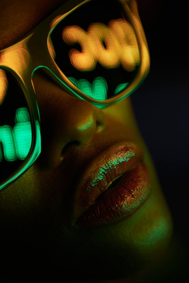
Fig 1
Each image is predominantly lit by two contrasting colours. In fig 1, the orange and green neon text is beginning to expand and create soft merging circles, which are contrasted beautifully with the sharpness of the frame of the glasses and also the colour reflected on the model’s lips.
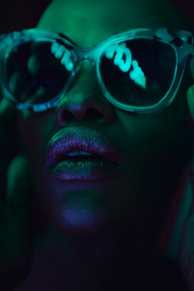
Fig 2
Fig 2 is a similar composition albeit darker, however the blue and green hues have created an almost metallic impression.
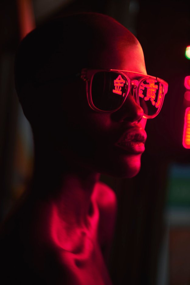
Fig 3
In fig 3, Guido has flipped the focus from the model’s features, to the detailing caught in the glasses themselves. The composition here is wider than fig 1 and 2, using a single colour light source. The model’s features are wonderfully embellished by the soft glow of neon red. We also see here a small section of the actual sign, just sneaking into the frame.
This is a brave set of images to showcase sunglasses, however, it works brilliantly. I’m guessing the target audience will be millennials – the under 30s, urban, hip, club-culture; hence the connection with this style of imagery.
I am planning on the lighting being the primary focus of my images, unlike Guido’s series, where the model/sunglasses is clearly the focus. I intend my images to be more abstract in nature, with the bokeh being the most dominant element in the frame. I find the shapes of the lights reflected in the glasses in fig 1 extremely interesting, and I hope to capture something similar.
References:
Mathew Guido. 2017. Eye Candy. [ONLINE] Available at: http://mathewguido.com/eye-candy/. [Accessed 19 October 2017].
Schon! Magazine. 2017. Eye Candy. [ONLINE] Available at: http://schonmagazine.com/eye-candy/. [Accessed 19 October 2017].
