New York GalleriesI went to New York in November, to meet up with my old school friends from Scotland. This was my fourth or fifth visit to the big apple, so while my friends shopped until they dropped or visited the tourist attractions, I used my time more wisely by squeezing in as many photographic galleries and exhibitions as possible. It proved to be a very useful and well-timed trip, considering I was at the point in my coursework where I was beginning to learn about context. The selection of galleries in New York are far superior to those I have on my doorstep in Dubai, and visiting so many really helped things to click into place. I realised that the meaning or concept behind a body of work doesn’t always have to highlight a social issue or raise awareness of something important, it can be much more simple, yet still be effective.
I have listed all the galleries and specific exhibitions below, with a short description.
INTERNATIONAL CENTRE FOR PHOTOGRAPHY
ICP Alumni Exhibition
I attempted to visit the current exhibition by Lauren Greenfield at the ICP, however, I didn’t realise that the gallery was housed in an entirely different building to the school. However, all was not lost, as there was an exhibition of alumni work on show throughout the corridors of the school, which I was allowed access to visit. It was very interesting to see such variation in the concepts utilised by the students. There was some really off-the-wall installations to be viewed. Some weird and wonderful. There were a couple that didn’t make any sense to me visually, and even when I read the original context. The one thing I realised as I wandered around, was that I enjoyed being in the university environment, surrounded by like-minded people. I sat for some time, soaking it all up.
‘Generation Wealth’ by Lauren Greenfield
This exhibition begins with a film that documents the concept and shoot. For me, the concept resonates rather loudly, not only because of where I live but also my personal feeling about the trend of our society, and the obsession with material goods and appearances.
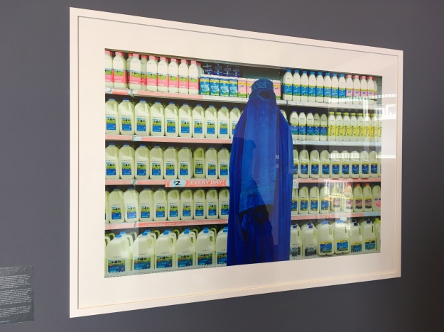
There were a huge amount of images, divided into geographic sections. Each section has written content to help communicate the specifics of the region / people / places. Unsurprisingly, there is a section on Dubai.
Everything has been shot in colour, in a documentary style with a person posing, very aware of the camera. Some of the images show great wealth in very obvious ways, others denote the flip side where everything has fallen apart. Some of the people’s stories are very harrowing. The takeaway emotion for me is quite strong, all surrounding a general feeling of disappointment in society. This series feeds the longing I have for a more fulfilled society that places more importance on living simply and valuing who people are, rather than what they have.
HOWARD GREENBERG GALLERY
This is exactly what a gallery should be like, it’s a nice open space with good quality work on show by multiple, well-known photographers. Friendly staff. There are multiple chairs dotted around so I could sit and ponder the works, and also write in my journal. I didn’t feel at all like I was unwelcome, despite being a mid-town, sales gallery.
Henri Cartier-Bresson
This was the first time I have seen any of Cartier-Bresson’s work in a gallery environment, and suffice to say i am delighted to experience this. However, his works occupied a very small area of the gallery, like a connecting hallway to the back of house. Had more than two people been in there, it would have been very crowded. Not what I expected for one of the masters. However, I was there on my own and subsequently had the section to myself. Seven pieces of artwork adorned the walls…
1. Ile de la Cite, 1952
2. Picnic on the banks of Marne, France, 1938
3. Seville, Spain, 1933
4. Sale of Gold, Shanghai, China, 1949
5. India, 1948
6. Alicante, Spain, 1933
And of course, the brilliant 7. Behind the Gare, Saint Lazare, 1932
‘In India’ by William Gedney
Possibly my favourite series from the whole New York gallery experience, was Gedney’s In India selection. The set is purely black and white, and depicts life in India, circa 1969-1971. I have written a separate entry for this exhibition, and can be read HERE
‘Bombay’ by Raghubir Singh
In-keeping with the Asian theme found throughout the HG Gallery, Singh’s work populates the main gallery space as soon as you walk in. His work depicts life in Bombay through the medium of street photography during the timespan of 1970s through to the 1990a. Rather interesting, he has chosen to shoot all his images in colour. His series is raw and gritty, something that I have tried to achieve when shooting the ‘other’ side of Dubai, in my square mile assignment. It is possible to peel away at the layers of his images to reveal a little more in the way of context. As with many of the ‘greats’ images, I find little niggles in Singh’s compositions that i didn’t find in Gedney’s work, for example small details creeping into the frame that don’t fully reveal themselves nor do they add any value. Or slightly skewed angles that do little more than annoy. Having said that, these things do add to the ‘of the moment’ feeling. Seeing these types of things really helps me to understand what is important to me, as both a photographer and a viewer.
‘Eternal Light’ by Kenro Izu
This series was in a room of its own, and rightly so. The pictures are in response to the question “where are people heading in this life and after?” The images are all very peaceful and enchanting perhaps helped, in part, by their location within the gallery and despite the fact that some capture the very clear images of deceased individuals. The pictures are all almost square in format which is quite unusual. I notice a set of four images arranged closer to each other than all the rest, which must denote a connection. The series within a series appears to depict the various stages of the local customs of dealing with human remains, after death. There are no strong colours used on any of these images, they are all muted colours as if to soften the harsh reality of death.
‘Blue’ by Kenro Izu
Occupying a small room off the main gallery, Izu had a second collection on show. This collection of seven images focus on the human form, capturing sections of a person’s body showing curves and shapes, sometimes cropping close, for example a set of hands, sometimes showing an entire body, but never the face. This suggests a definite disconnect from portraiture. The interesting part of this series is the connection of colour – the images are all duotones of black and blue with the same line used throughout.
PACE MACGILL GALLERY
I thought this was a wonderful gallery space that has obviously been an apartment in a previous life, from the layout. The floors were all a beautiful wood, and the walls were painted a mid-grey, which is quite unusual, gallery walls are often kept white so as not to distract. However, I felt awkward in this space, as it was clear that this gallery was more about the selling of art, rather than the viewing of art. Perhaps because of this, I didn’t really connect with the work on show. There was no obvious theme, and subsequently it all felt a little disjointed. I didn’t understand it and there was no written context to inform me better.
‘Here on Earth Now – Notes from the Field’ by Emmet Gowin
MOMA
‘At Work’ by Lee Friedlander
No trip to New York would be complete without a trip to the Museum of Modern Art. And if never disappoints. Unless you specifically want to experience photographic exhibitions, which was my intent. There was a lack of such exhibitions at the time of my visit. I did however, find a collection of images by Friedlander from his ‘At Work’ series. The images were shot during the 1980s, of computer operators as they stared at their relatively new work tool. We can obviously deduce that they are of course hard at work, however the emotional state of each operator can be read as boredom. It evokes you to feel sorry for the operators, however, you then begin to imagine what you look like when you work. The conclusion is that you must appear exactly the same. Thirty years later, the images have a wonderful vintage feel to the style of the people and indeed their surrounding offices.
THE APERTURE GALLERY
This is a very cool space. This gallery was founded by Ansel Adams, amongst others. There is an obvious difference in atmosphere being down in Chelsea, from the uptown galleries. There is more of a buzz, and it’s obviously less stuffy. This is reflected in the footfall, it is much busier – literally with crowds of people. However, I noticed that the volume of people made it more difficult to really look at the works on show and spend time analysing.
‘Imperial Courts’ by Dana Lixenberg
LIxenberg has a series of images in the gallery that depict the ‘other’ side of LA which is a far cry from the wealthy, celebrity fueled lifestyle that most people will connect with LA. I like this approach, and I have tried to do something similar within my square mile assignment, in Dubai. Lixenberg really captures the emotion in her subjects, there is an absolute honesty emanating from each piece of work. She began this project in 1992 by traveling to the south side of LA after the Rodney King incident. She was there on an assignment but felt the need to stay longer and document the rebuilding through her portraiture. She felt there had been a very one-sided reporting on the incident.
I am always very drawn to photographic bodies of work based on social documentary. Perhaps its because I find it very easy to understand, as an avid people watcher.
Dana’s work won the Deutsche Börse Photography Foundation Prize 2017.
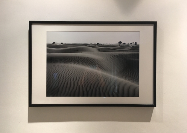
Awoiska Van Der Molen
Of all the bodies of work I experienced while in New York, Awoiska Van Der Molen’s probably taught me the most. My initial reaction was that I simply didn’t understand it, and, I was almost tempted to move on. But I decided to loiter and challenge myself. The connection between each piece appeared to be ‘nature’. Each piece was large format, big and bold against the white gallery walls. And dark, very dark. You need to almost search for the detail. After much pondering, my conclusion was that the images are suggestive of the disappearance of nature. I saw darkness where I should have seen glorious colour. I found it difficult to see any real detail, where I should have been bombarded with the multitude of patterns that nature provides. As I was standing, allowing my eyes to roam over the compositions while figuring out the photographer’s intent, I realized that it almost didn’t matter. What struck me was the simplicity of the result, and the connection of all the images. This was fine art photography at its best. And it suddenly all made sense, the concept of concept can be anything you want. It can be so simple but still achieve amazing effective results.
I thought I had somehow missed the original context of the images in amongst the crowds of the gallery, but researching the artist online afterwards, I discovered that this is an intentional factor.
Awoiska’s work was shortlisted for the Deutsche Börse Photography Foundation Prize 2017.
LIK SOHO
A friend of mine wanted to visit the Peter Lik gallery to enquire if her pieces of his work had appreciated in value . I must confess that I hadn’t heard of him, prior to this trip. I was immediately struck by the blast of colour that he has adopted as his signature style. If artwork could shout, it would sound like this. But i like it. I constantly battle with colour images, as I almost always favour black and white, however seeing such vibrancy has ignited an interest in colour in me. I have since researched Lik, and my findings are rather interesting – he didn’t study in any way, neither practical or theory, and he claims to know or be interested in any other practitioners, either contemporary peers or the masters. The art world and critics are not a fan of his, which i wonder if this is because he is an outsider. Had he studied or been more respectful to the industry, would he have been more accepted? many have described his work in a very negative light, claiming the over saturation as an abomination. In 2014, Like sold a piece of work for a reported $6.5m which was at the time, the highest price paid for a piece of photography. Not bad for an outsider. He creates a demand for his own work by intentionally increasing his prices for his limited edition pieces as time goes by, this ensures that by the time he only has a few pieces left, they are much more expensive. This also ensures that keen buyers are quick off the mark. He is a shrewd businessman.
——————————
Bibliography;
The International Center of Photography. 2018. Inernational Center of Photography. [ONLINE] Available at: https://www.icp.org. [Accessed 18 January 2018].
Generation Wealth by Lauren Greenfield. 2018. Generation Wealth by Lauren Greenfield. [ONLINE] Available at: https://www.icp.org/exhibitions/generation-wealth-by-lauren-greenfield. [Accessed 18 January 2018].
Howard Greenberg Gallery. 2018. Howard Greenberg Gallery. [ONLINE] Available at: http://www.howardgreenberg.com. [Accessed 18 January 2018].
Howard Greenberg Gallery. 2018. Henri Cartier-Bresson. [ONLINE] Available at: http://www.howardgreenberg.com/exhibitions/henri-cartier-bresson. [Accessed 18 January 2018].
Howard Greenberg Gallery. 2017. William Gedney: In India. [ONLINE] Available at: http://www.howardgreenberg.com/exhibitions/william-gedney-in-india. [Accessed 18 January 2018].
Howard Greenberg Gallery. 2017. Raghubir Singh: Bombay. [ONLINE] Available at: http://www.howardgreenberg.com/exhibitions/raghubir-singh-bombay. [Accessed 18 January 2018].
Howard Greenberg Gallery. 2017. Kenro Izu: Eternal Light. [ONLINE] Available at: http://www.howardgreenberg.com/exhibitions/kenro-izu-eternal-light. [Accessed 18 January 2018].
Howard Greenberg Gallery. 2017. Kenro Izu: Blue. [ONLINE] Available at: http://www.howardgreenberg.com/exhibitions/kenro-izu-blue2. [Accessed 18 January 2018].
Pace MacGill Gallery. 2017. Pace/MacGill Gallery. [ONLINE] Available at: http://pacemacgill.com. [Accessed 18 January 2018].
Pace MacGill Gallery. 2017. Emmet Gowin. [ONLINE] Available at: http://www.pacemacgill.com/show_installation.php?item=168. [Accessed 18 January 2018].
MOMA. 2017. MoMa. [ONLINE] Available at: https://www.moma.org. [Accessed 18 January 2018].
Aperture. 2017. Aperture. [ONLINE] Available at: https://aperture.org. [Accessed 18 January 2018].
Aperture. 2017. Deutsche Börse Photography Foundation Prize 2017. [ONLINE] Available at: https://aperture.org/exhibition/deutsche-borse-photography-foundation-prize-2017/. [Accessed 18 January 2018].
Peter Lik. 2017. Lik Soho. [ONLINE] Available at: http://www.lik.com/theartist/photos/likgallery/soho.html. [Accessed 18 January 2018].
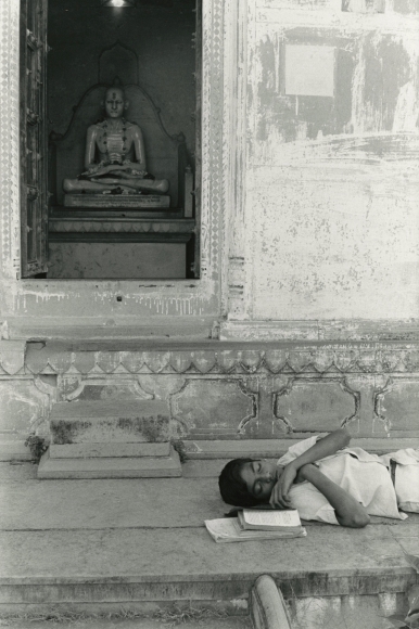
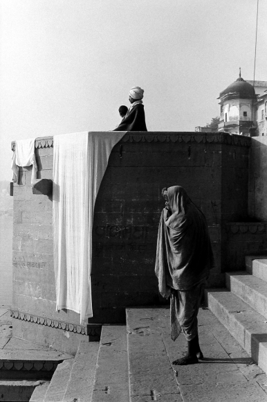
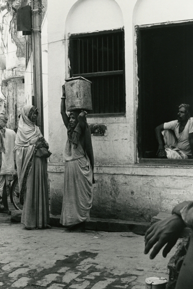
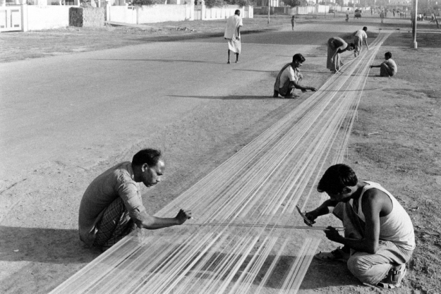
 Fig 1
Fig 1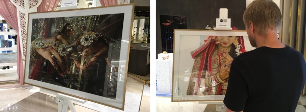
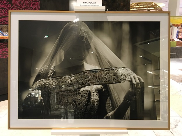

 Fig 3 (2017)
 Fig 4 (2017)